Menu

Google Data Studio’s strength is presenting and sharing data visualizations, roping in metrics from any number of sources. As a creative tool, it’s only limit is your imagination. To get your juices flowing, we’ve scoured the internet and compiled the 11 most creative Google Data Studio dashboards we could find. Most of them you can copy or purchase to quickly plug in your own data. Since Data Studio isn’t just helpful for marketing or digital data, we’re including five dashboards outside the marketing world that may spark new ideas for your own data visualizations.

This dashboard cleanly shows all the metrics you’d want to monitor concerning the speed of your site, including load times by geo, top pages, time of day, month-to-month, and more. One of its most creative functions are the clickable buttons along the top that let you isolate speeds by device, browser, and operating system. The dashboard also makes use of little touches that help bring it to life, like the color scheme. Another is the images in the top right corner of each chart that help depict what data you’re viewing. It’s everything a Data Studio dashboard should be – intuitive, creative, and most of all, helpful.

On the opposite side of the spectrum is this creative dashboard notable for its understatement. It focuses on only a few key metrics about website visitors and contains lots of empty space. Using some of Data Studio’s visual elements like text boxes, images, and colors, the dashboard tells a story and gives you exactly what you need to know. It’s a great example of beautifying a dashboard through small touches.

This dashboard doesn’t overwhelm you with data but makes use of images and select graphs to bring your Instagram data to life. At the top, it displays the key data about your page – impressions, followers, and likes, and can be filtered by date. One creative aspect in this report is that it actually pulls in your Instagram images and caption into Data Studio so that you can look at metrics alongside the actual post.

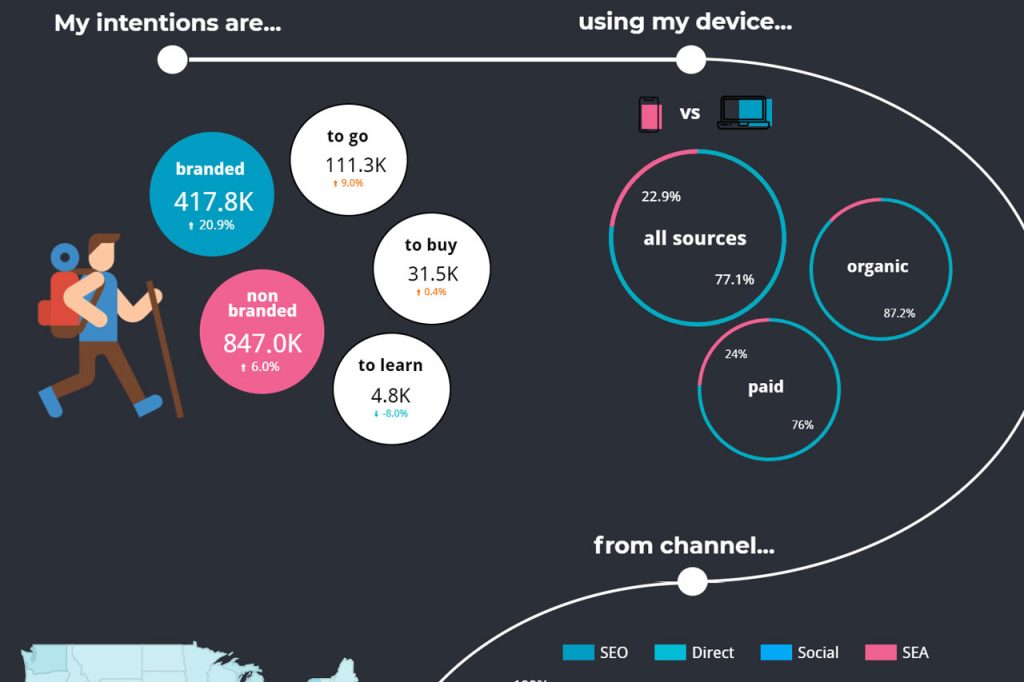
The goal of every digital marketer is to understand where the audience comes from and what they do once they hit the site. This user journey dashboard does a deep-dive on the latter, helping you parse out user intent, the path they take through the site, and the dropoff points along the way. Furthermore, the dashboard makes strategic use of Data Studio’s vertical potential by mapping out the journey top to bottom, the same way you’d read a page.

This ecommerce dashboard presents the whole picture of your site’s online shopping performance. It combines some of the best elements we’ve brought up with the previous dashboards on this list – customizable data, clear visualization (in this case a handy funnel), and a top to bottom flow. It’s a one stop shop to quickly gauge KPI’s, revenue, purchases, top products, channels, and then to compare it all to historic data.
These next five dashboards take a different approach to Data Studio, telling a story though plugging into data sources outside Google Analytics or staple marketing channels. While you may not want to replicate them exactly, they highlight some of the unique capabilities Data Studio has to offer.

The Raptor’s shocked the NBA with a remarkable run through the playoffs in 2019, ultimately defeating the Golden State Warriors in the championship. Using data from the NBA, each chart represents one game and the minute by minute +/- score deficit the Raptors faced. It’s an interesting visualization of the momentum a team gets from a scoring streak, and highlights just how dominant the Raptors could be in certain games.

Pumpkin Spice obsession hits every year just as summer turns to autumn. This dashboard tells the story though data, turning Data Studio into an infographic maker. Instead of a static image, however, this one’s dynamic, allowing users to hover and click on different data points to investigate more closely. With careful attention to design and colors and by incorporating text and image, the dashboard shows just how beautiful data can be.

Speaking of food, this creative dashboard utilizes a fairly standard Data Studio display, the stacked bar chart, to explore the travels of Anthony Bourdain. Lining up charts back to back makes for a more interesting view and helps the data appear more legible. Each line represents a new season and every color a new world region. The length of the bar corresponds to the number of episodes in that season. It’s simple and creative, demonstrating that your dashboard doesn’t have to reinvent the wheel to be effective and aesthetic.

Just how important is winning the first race of the season to a competitive Formula 1 Driver? This dashboard has the answer, not to mention a beautiful data visualization to help you learn more. Each line represents a year, each dot a race. A red dot means the final season winner won that specific race, while a grey dot means they lost. By hovering over each dot, you can learn more about the race and who won. So what’s the answer? A clean 50% of the time, the winner of the first race will end up winning the season.

If you believe in UFOs, you’re not alone. As this dashboard shows, the number of reported sightings has risen almost exponentially since 1995. The rest of the charts show data on what people reportedly saw, when they saw it, and where. Like the pumpkin spice dashboard, this dashboard’s strength and creativity lies in its exploratory nature. Not only would it look great on a poster, but it’s fun to click through.

The rise of fitness trackers has led to an increase of data sharing and collecting. This dashboard, pulling data from Strava, shows off this rider’s latest treks, distance and elevation totals, data across the seasons and months, and more. The data sits seamlessly on top of a background image, giving it a true custom feel, almost as if the report were embedded in the graphic. Also, while we’ve seen clickable buttons before, some of these on the dashboard, like the row of icons below the “Latest Rides” chart, take the user to a new page in the dashboard. It’s a smart way to help viewers explore the data based on their own curiosity.
All 11 dashboards have a few things in common: they use pictures and strong color themes, direct your eye up and down the page, and make it easy to filter and explore data. Use the same principles to create your own dashboards, interactive infographics, and reports. Above all, don’t be afraid to add creativity to your own reports. It’s one of the most effective ways to tell a story with your data.
If you know a dashboard that should be on this list, let us know and we’ll add it!