Menu


In this article we take a deep dive into Google Data Studio’s toolbars. We’ve outlined 3 steps you can follow to give you a basic understanding of how to create a Google Data Studio report.
This is the second article in a series of ‘How to’ guides. You might like to visit the previous article on, ‘How to Connect Google analytics to Google Data Studio’, first to get a thorough understanding of how to connect to a data source and start working with data in GDS.
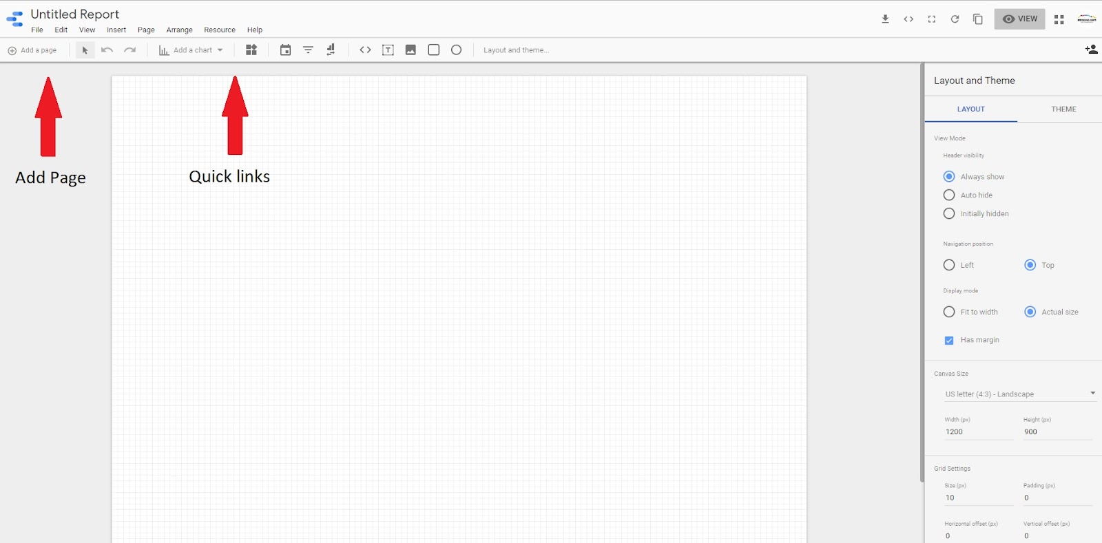
1) Just underneath the menu, you will see a list of quick links. You can add many pages to each report. Add a new page by clicking ‘+Add page’ in the top left corner.
2) You have the options to add a range of data visualizations from bar charts to bullet charts.
You also have the options to add some standard elements such as Text, images, and rectangles. Finally, at the end, you’ll see two options to add filters on dates and dimensions.

To the right of the page, you will see an area with two tabs – one for report layouts and another for report themes.
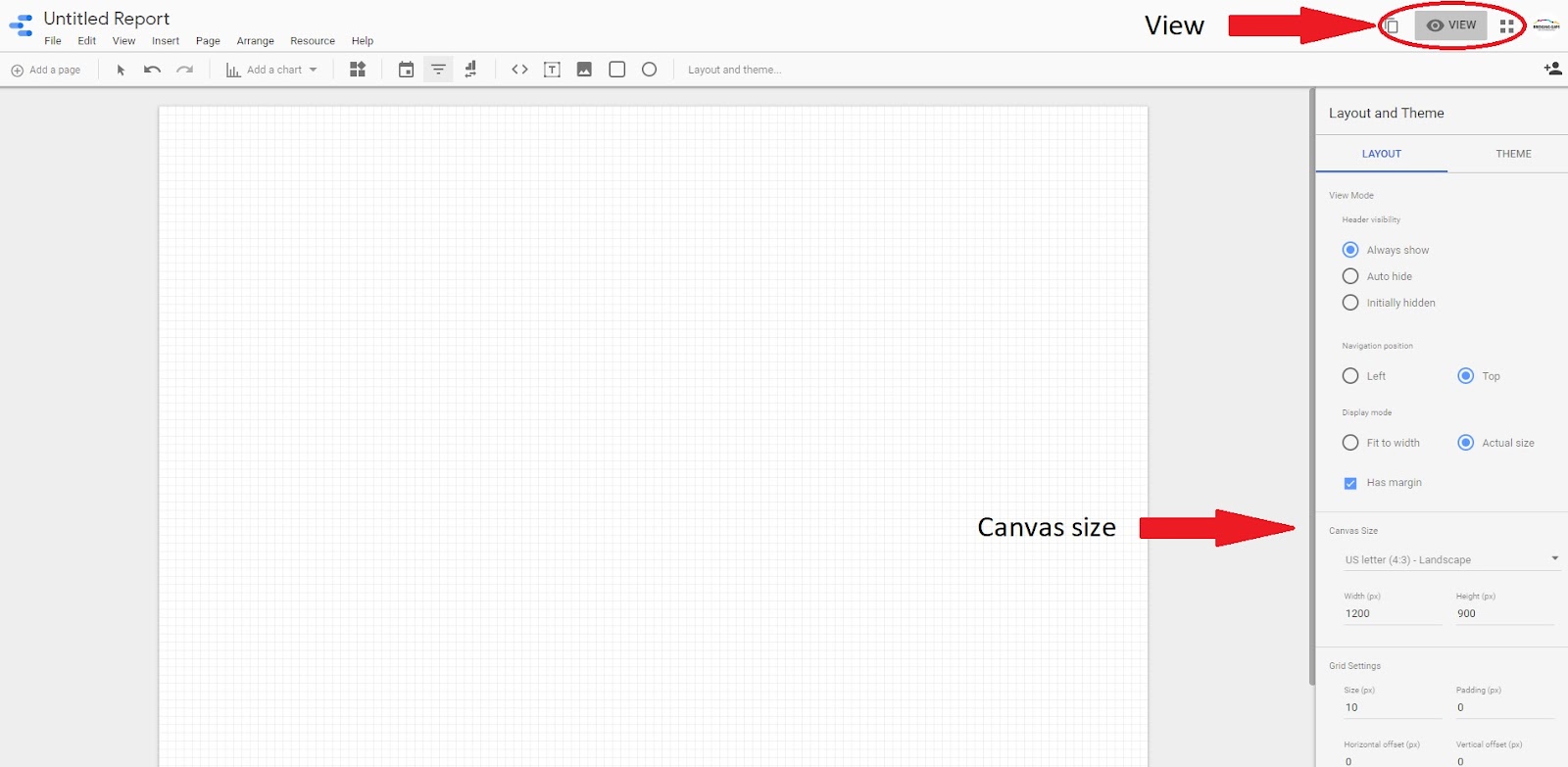
3) To see your report as others would view it, click ‘view’ at the top right of the page. This is different from how you would see it in the edit mode.
Under layout options, you can also edit other things such as canvas size.
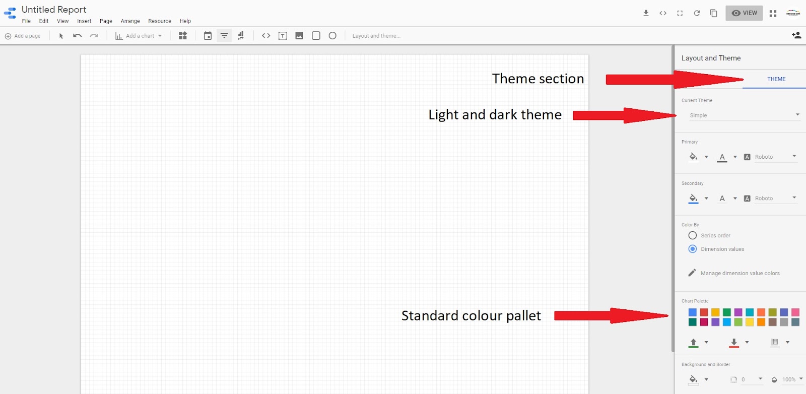
In the ‘theme section,’ you can choose between a light and a dark theme. As well as a standard colour pallet for your text, charts and other elements on the page.
Don’t miss the next article in our ‘how to’ series – More Options for Time Series, Bar and Pie Charts.