Menu


In this article, we are going to learn how to use GDS’s dashboard by exploring different filters. This report is a continuation of our previous article, How to: Time Series Charts, Bar Charts and Pie Charts in Google Data Studio. It is recommended that you read the previous articles in our ‘how to’ series before moving onto this one.
We will be exploring 3 types of filters on Google Data Studio that enable you to focus on subsets of your data:
This article consists of 12 steps to demonstrate how to use filters to create an interactive report.

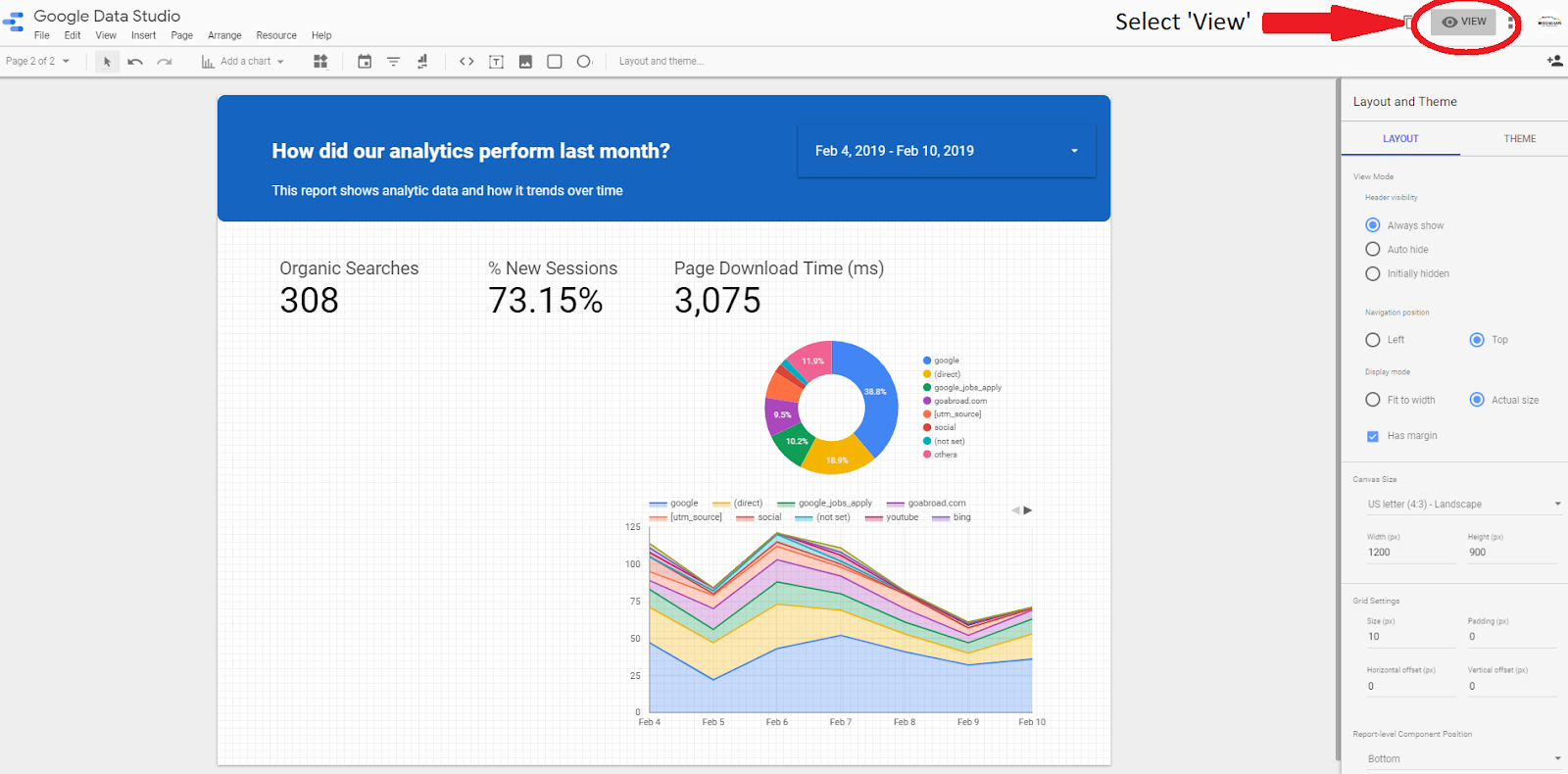
1) One way to keep your users engaged with your reports is to add filters. To start, add a date range filter into your report. This filter allows your users to control the timeframe of your report. To add this filter, click on the ‘date range’ filter icon in the quicklinks menu and add it to the header of your report. Select ‘Style’ to change the font size and colour of the text.
2) To select a date range, switch back to the ‘Data’ Tab. By default, the filter prompts you to select a date range.
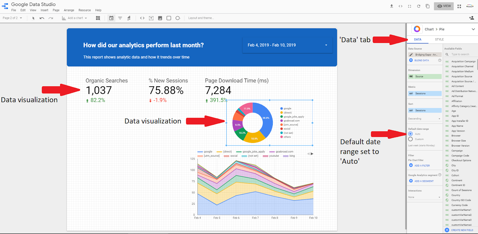

3) In order for the ‘date range’ filter to take effect, it is important to note that any ‘custom’ date ranges that you have previously applied, need to be changed to ‘auto’. This is done by selecting ‘auto’ in the data tab.
4) In order to see the results of the interactive filter, exit the editing mode by clicking ‘view’ in the top right-hand corner of the page.

5) When users view your report, they will now have the ability to use the date range filter. This will allow them to view data from previous weeks, months or even years.
6) A dimension filter enables you to categorise your data by different criteria: e.g country, city or user profiles.
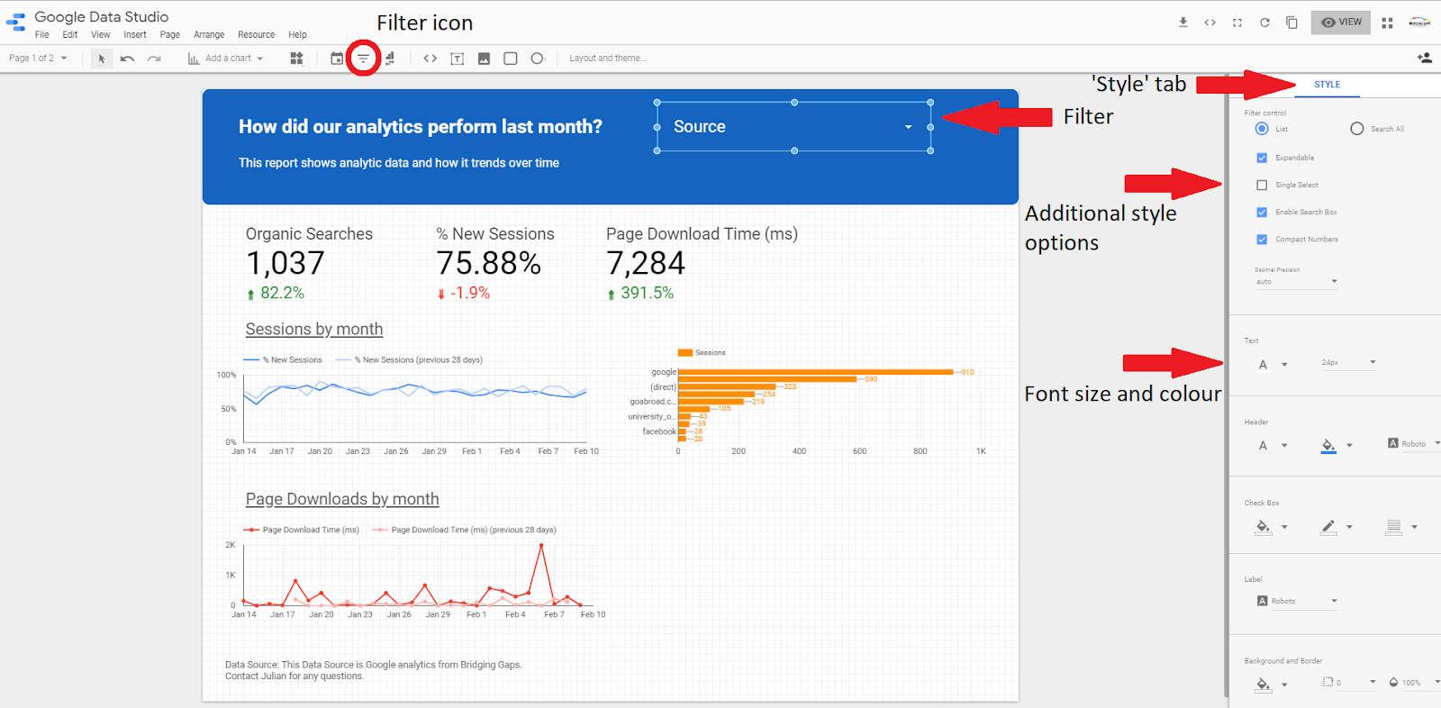
In order to filter by dimension, click on the ‘filter’ icon in the quicklinks menu and add it to the header of your report. Next, select ‘style’ to change the font size and colour of the text. There are also some additional style options available with this filter.
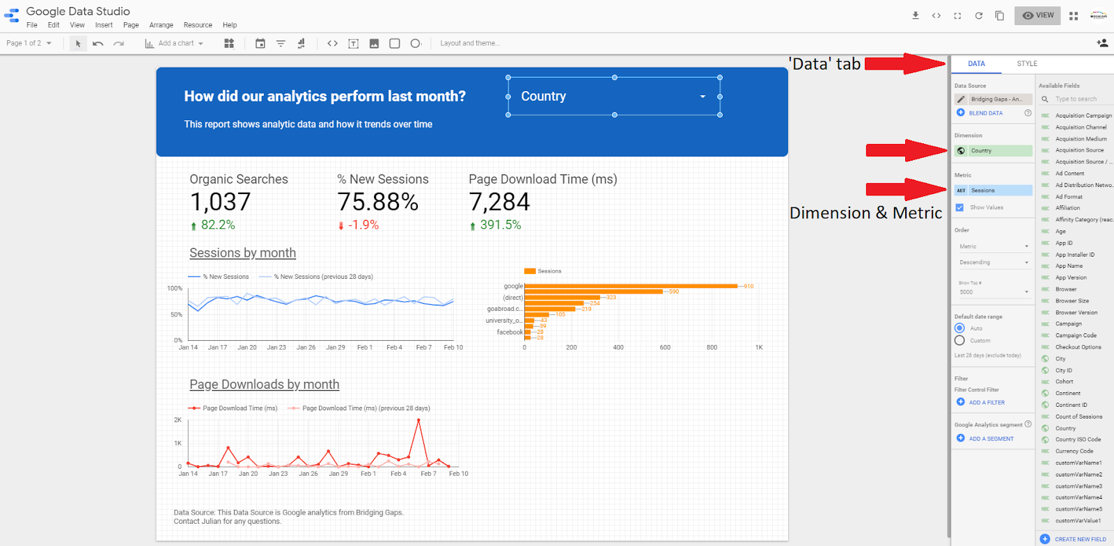
7) It is important to note that the ‘data’ tab needs to be selected in order for you to change the dimension and metric settings.

8) To see the filter in action, click the ‘view’ mode. You have the option to use the search bar to search for a country you are looking for. If you would like to select only one option, hover over the option and select ‘only’.
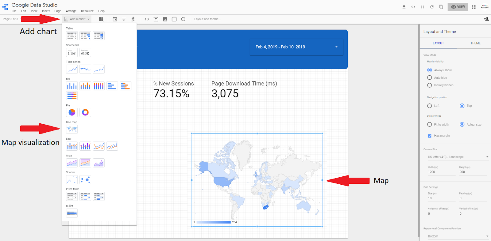
9) For this example, you need to remove all data visualizations except the key summaries. Select the ‘Geo map’ option from the ‘add a chart’ drop-down menu and position it wherever you feel it is most suitable on your report.
10) This filter displays data according to geographical location. The map visualization is set to default which displays country (dimension) by sessions (metric). If you would like to change these settings, simply click on the ‘dimensions’ or ‘metric’ tabs and select one from the list. It is important to note that your geo map has to be selected before attempting to change the settings.
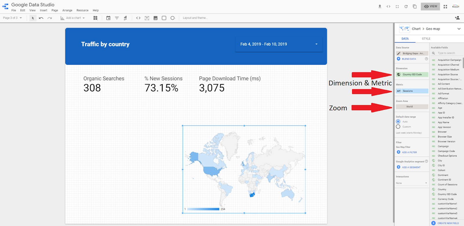
It is also possible to zoom into a country to display data from a specific region or city.
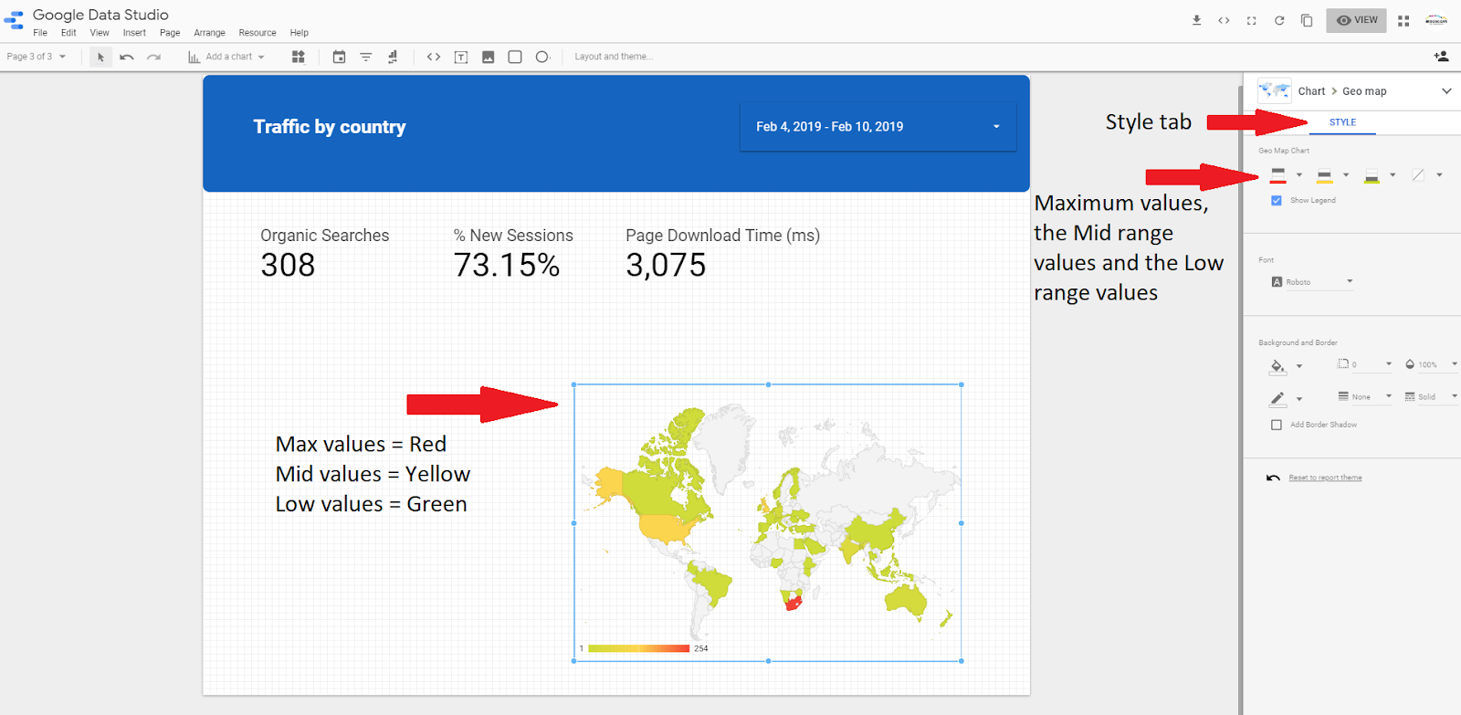
11) There are a few style options available with the map. The default setting displays the countries with the highest number of sessions in blue. In the ‘style’ tab, it is possible to select additional colours in order to display other values.

12) It is possible to display the sessions per country without having to hover over the map. To do this, you need to copy your map and change the data visualization type to a table.
Don’t miss the next article in our ‘how to’ series: Advanced Data Visualization!