Menu


Google Analytics provides a wealth of information on website performance such as; who is visiting your site, where they came from, how long they stay on your site and how many pages they have viewed. As well as much more info. By connecting Google Analytics with Google Data Studio, you are able to display this information in a dashboard and visualise it in an interactive way.
Before connecting to GDS it’s essential to assign the right permissions in GA, read our in depth article on how to do this.
While it is possible to view dashboard style reports directly in Google Analytics, GDS has a number of advantages, such as being able to blend data sources together, report in a more visual manner and provide better access to this data for those not familiar with the Google Analytics interface.
This article outlines 9 steps to help you create reports using Google Data Studio.
If you missed our previous article, ‘Understanding the Layout of a Report’, you might want to check it out before progressing as it provides a solid background to navigating through GDS.
Sign in to Google Data Studio using the following URL: https://datastudio.google.com/overview
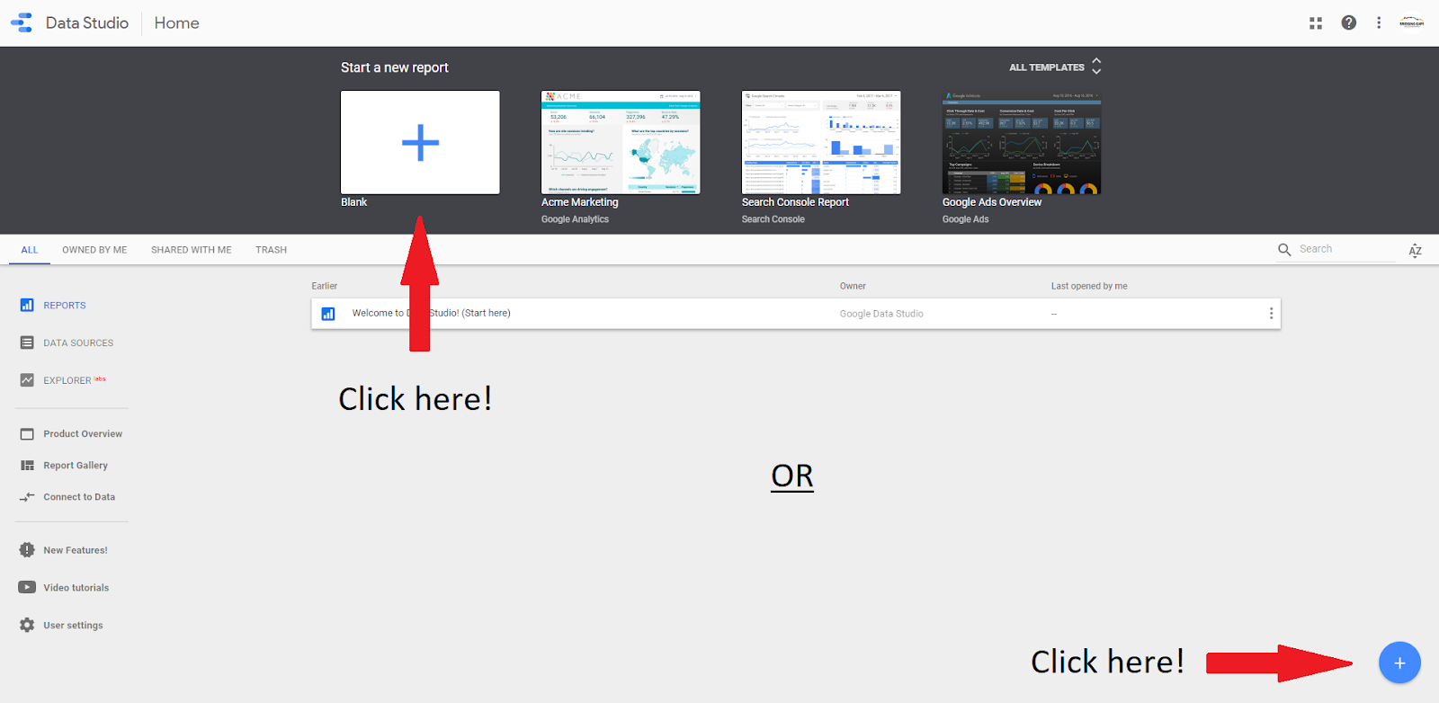
1) In order to create a report, click the ‘+’ button at the top of the page or bottom right-hand corner.
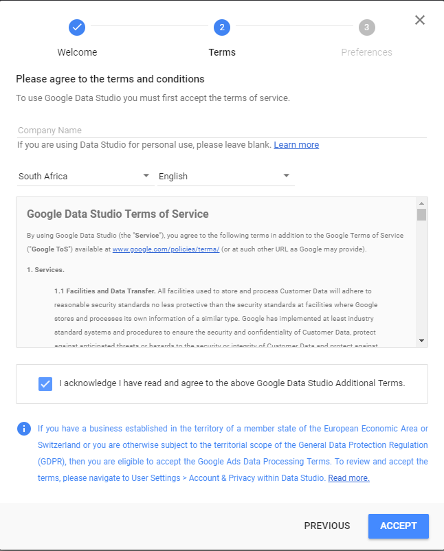
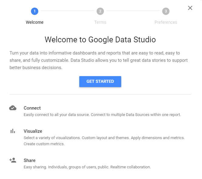
2. You will then be prompted with a welcome message. Follow the steps to move on to ‘terms and conditions’ and then ‘preferences’.
3) Once you have completed these steps, Google Data Studio (GDS) will take you back to step 1. Here you will need to select the ‘+’ button again to begin creating your report.
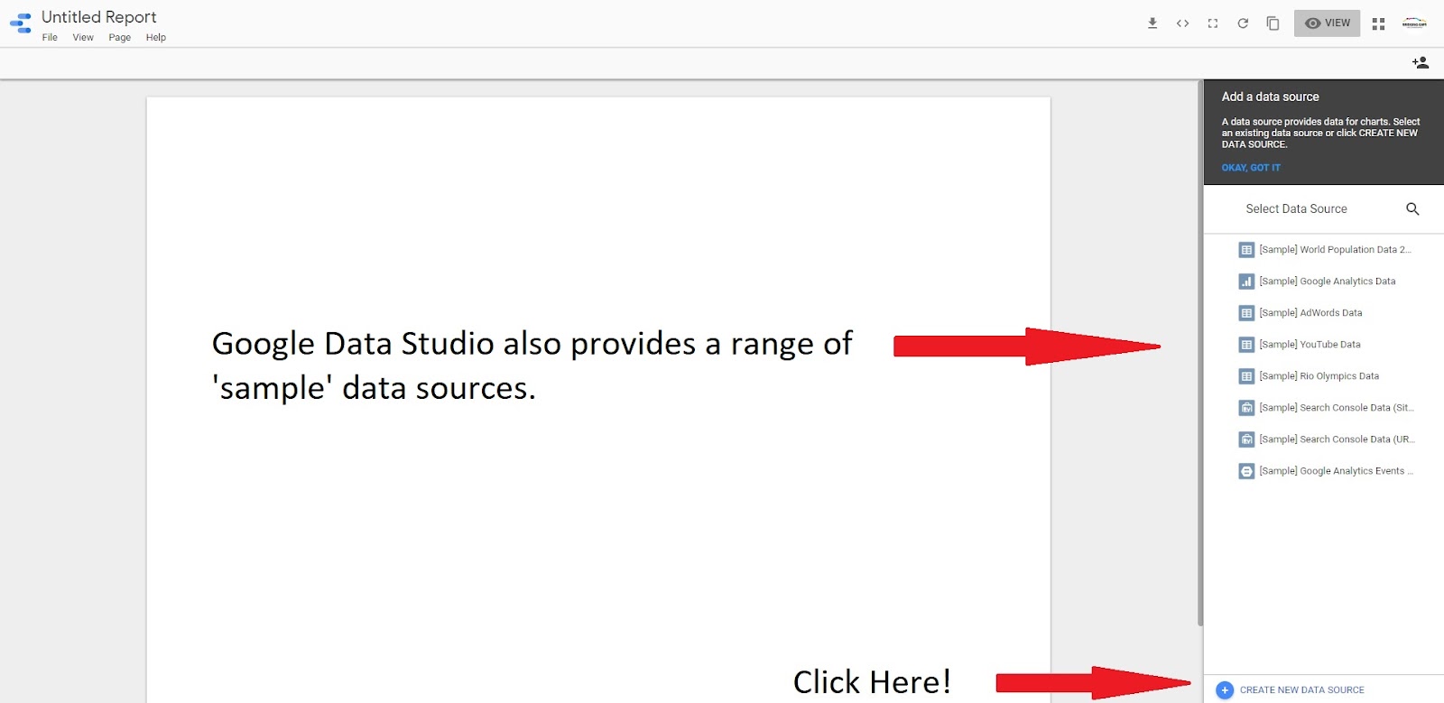
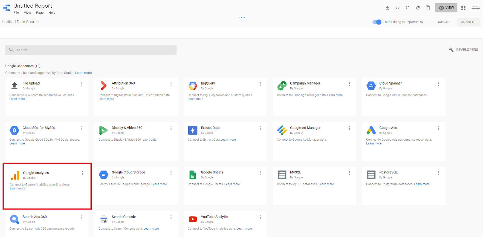
4) The next step is to add your own data source. Do this by selecting ‘create a new data source’ >> ‘Google Analytics’ >> ‘authorize and connect’.
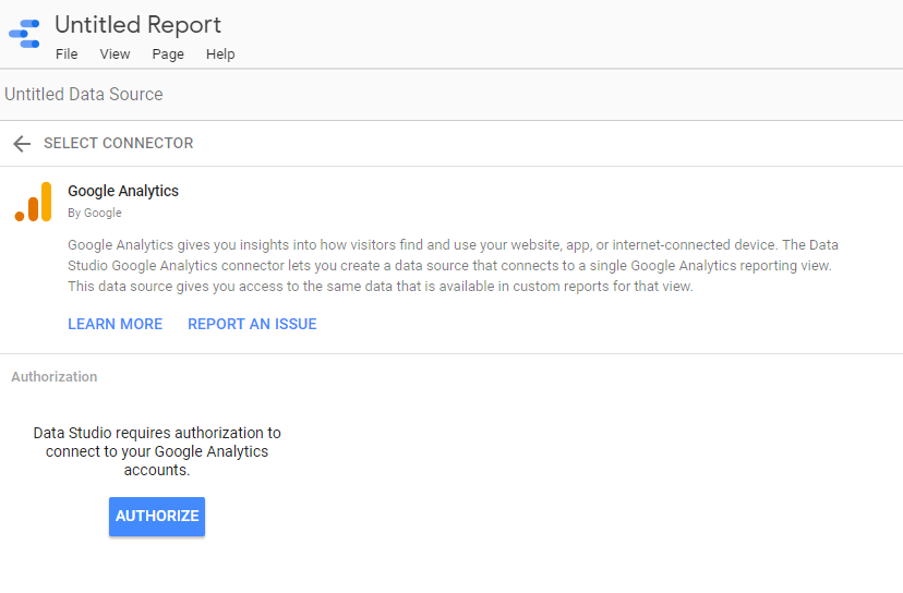
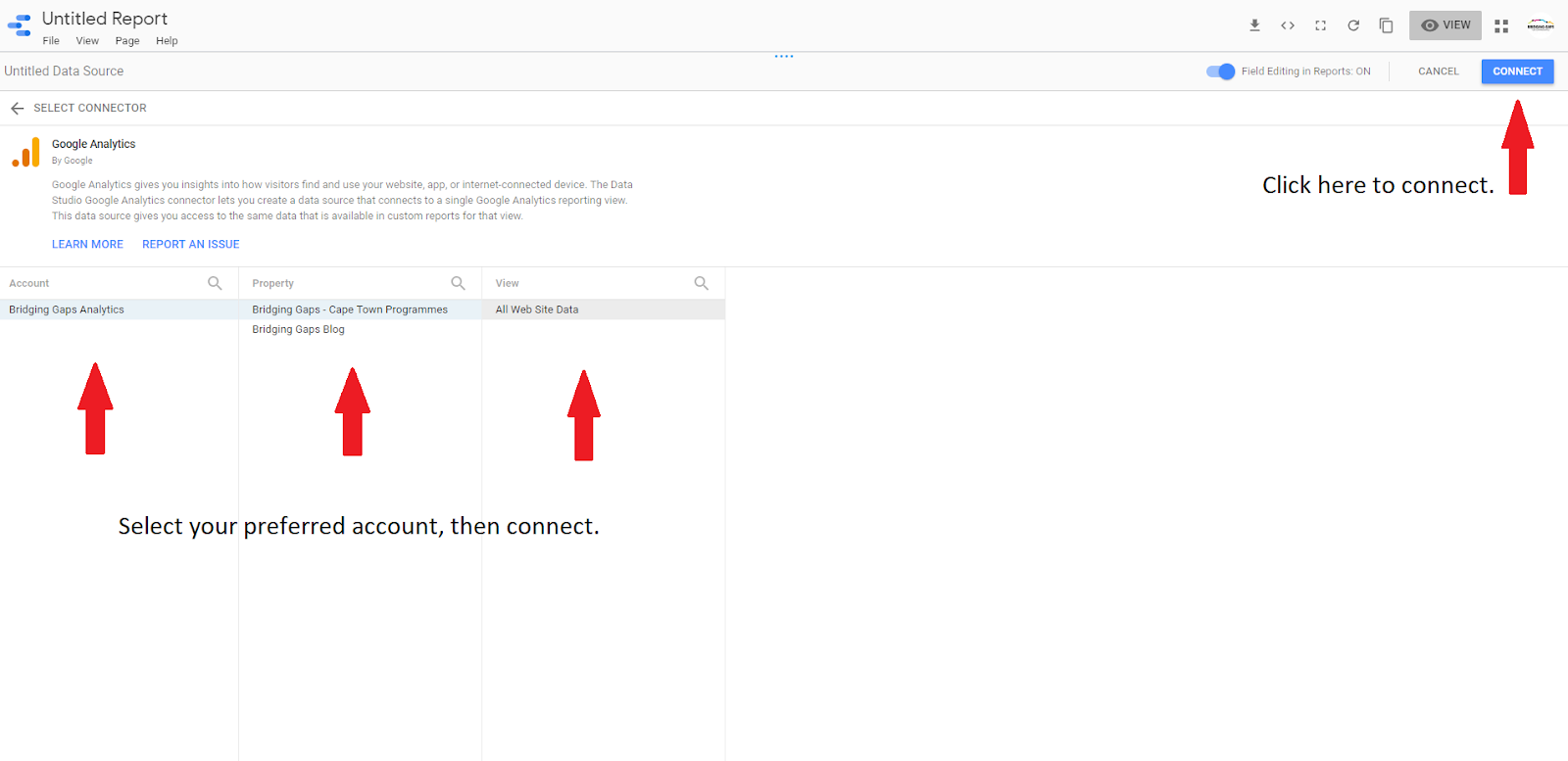
5) You will then be asked to sign in to your Google account so that GDS can access your Google Analytics. Once signed in, you will be presented with the following page. Next, select your preferred analytics account and connect.
6) The next page you see will be the ‘Data Source Review Page’. Here you will learn more about the specific fields GDS recognizes within your data set.
You will be presented with a list of field names, field types, field aggregation rules and descriptions. On a more advanced level, if you are looking to create calculated fields or change metric formatting, these fields can be edited. Otherwise, these fields should be left as they are and you can proceed to the next step, ‘add to report’.
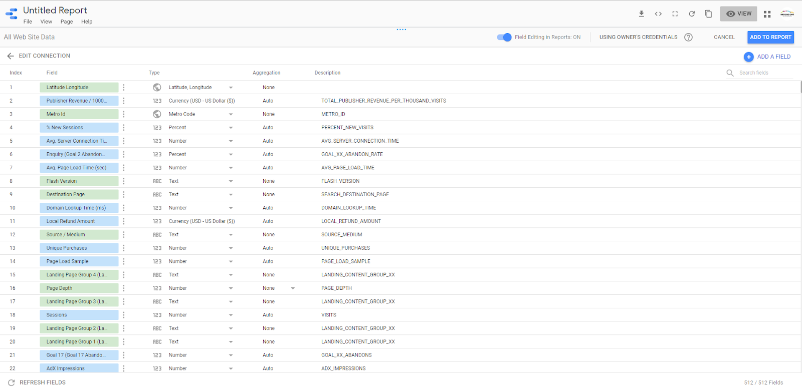
Field names: The name of the dimensional metric in your data. Dimension is a categorical value such as device type. Metric is a numerical value such as the number of visits to your website.
Field type: This describes the data type of your field. For example; number, text, percentage or currency.
Default Aggregation & Default Description: Google automatically updates these fields so, no changes are necessary here.
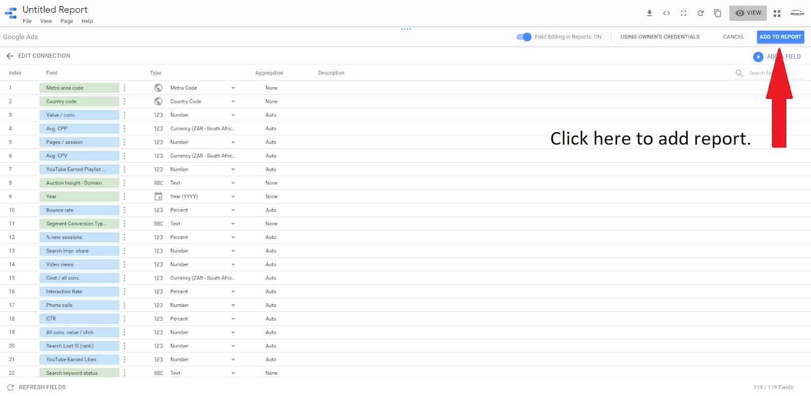
7) When you are ready to publish, select ‘add to report’.
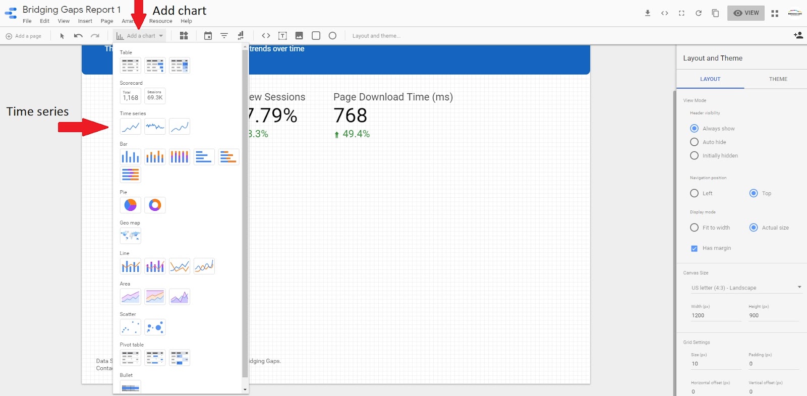
8) Creating Data visualization:
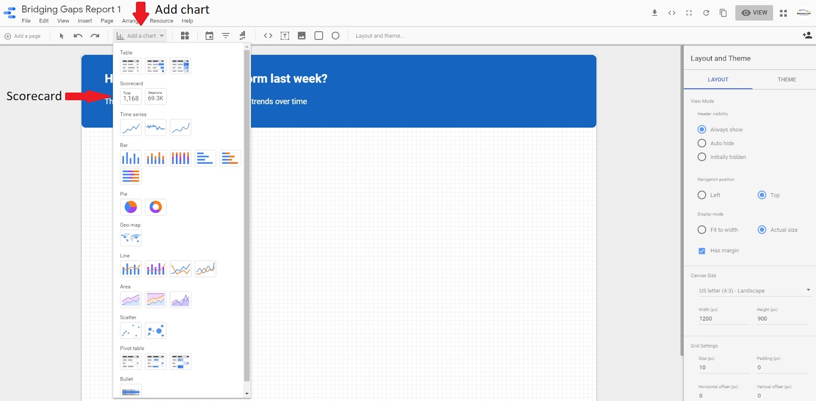
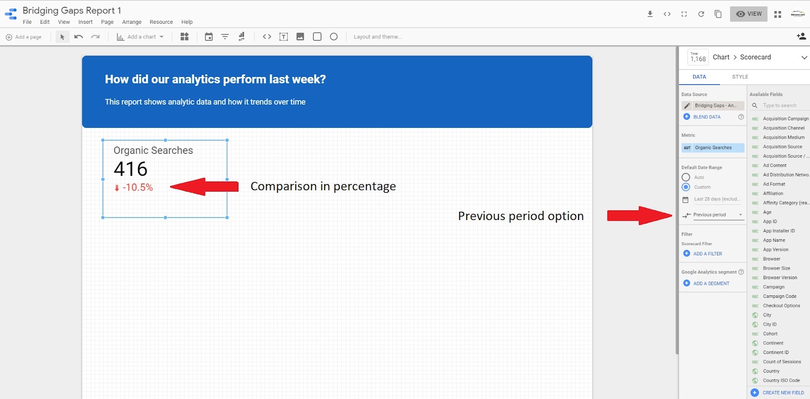
One of the first data visualizations you can add to your report is called ‘The Scorecard’. ‘The Scorecard’ is a good option if you want to display key summary numbers. Simply click on the ‘add chart’ drop-down menu icon in the ‘quicklinks’ and select ‘Scorecard’.
Once you have added The Scorecard to your report, you have the option to change the metrics and time period under the ‘DATA’ tab on the right side of your screen.
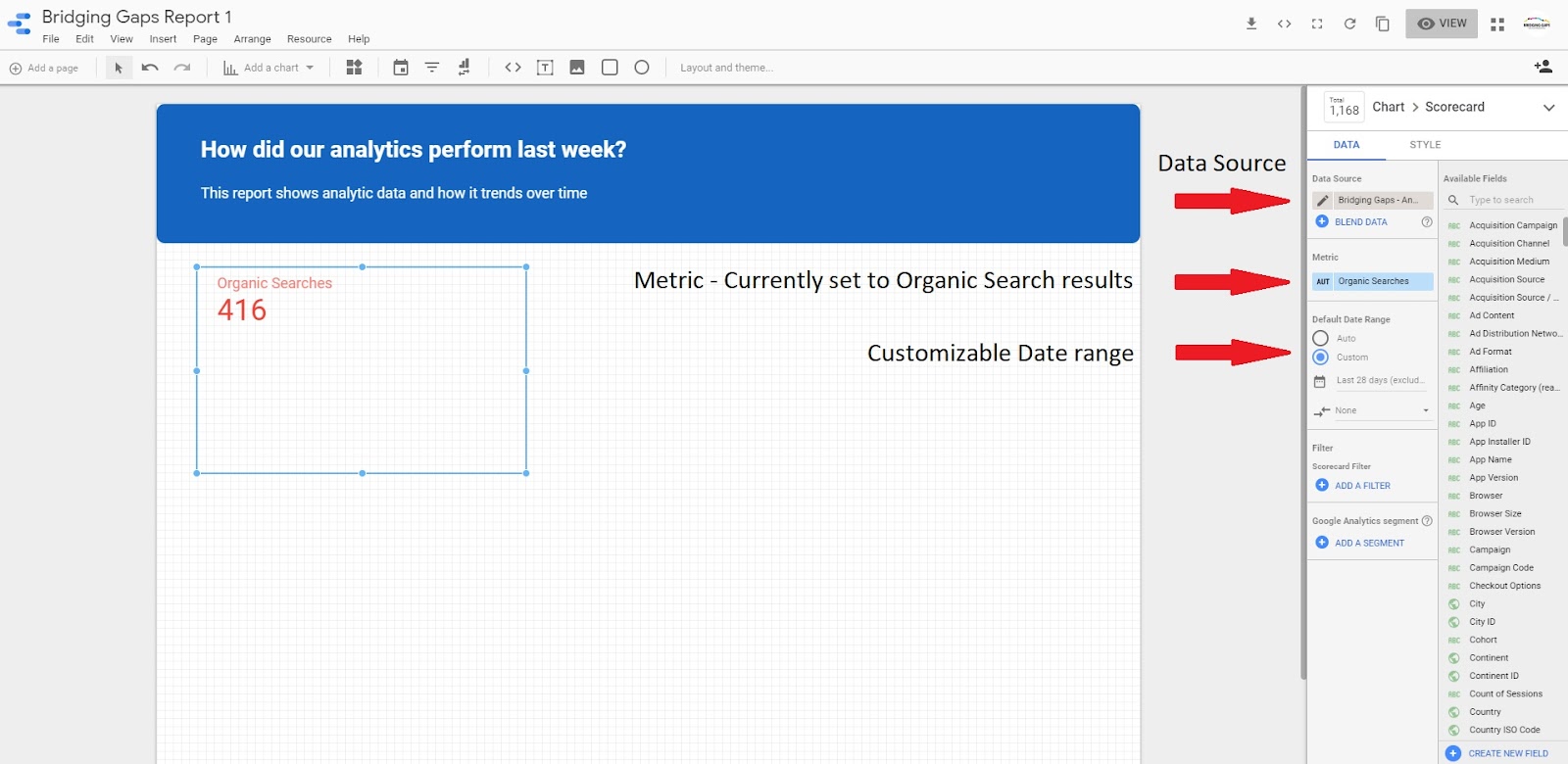
You also have the option to compare your results over different time periods. To do this, click on the ‘compare against previous period option’ underneath the date range.
You can proceed by adding additional scorecards to your report and changing the metrics to view different results. You also have many options to edit these scorecards – these can be found under the ‘STYLE’ tab to the right of the screen. In order to make any changes you need to ensure that your scorecard is selected.
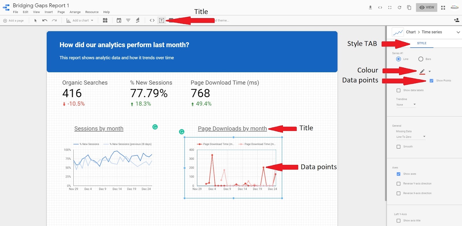
9) Adding time series charts:
Simply click on the ‘add chart’ drop-down menu icon in the ‘quicklinks’ and select a time series chart.
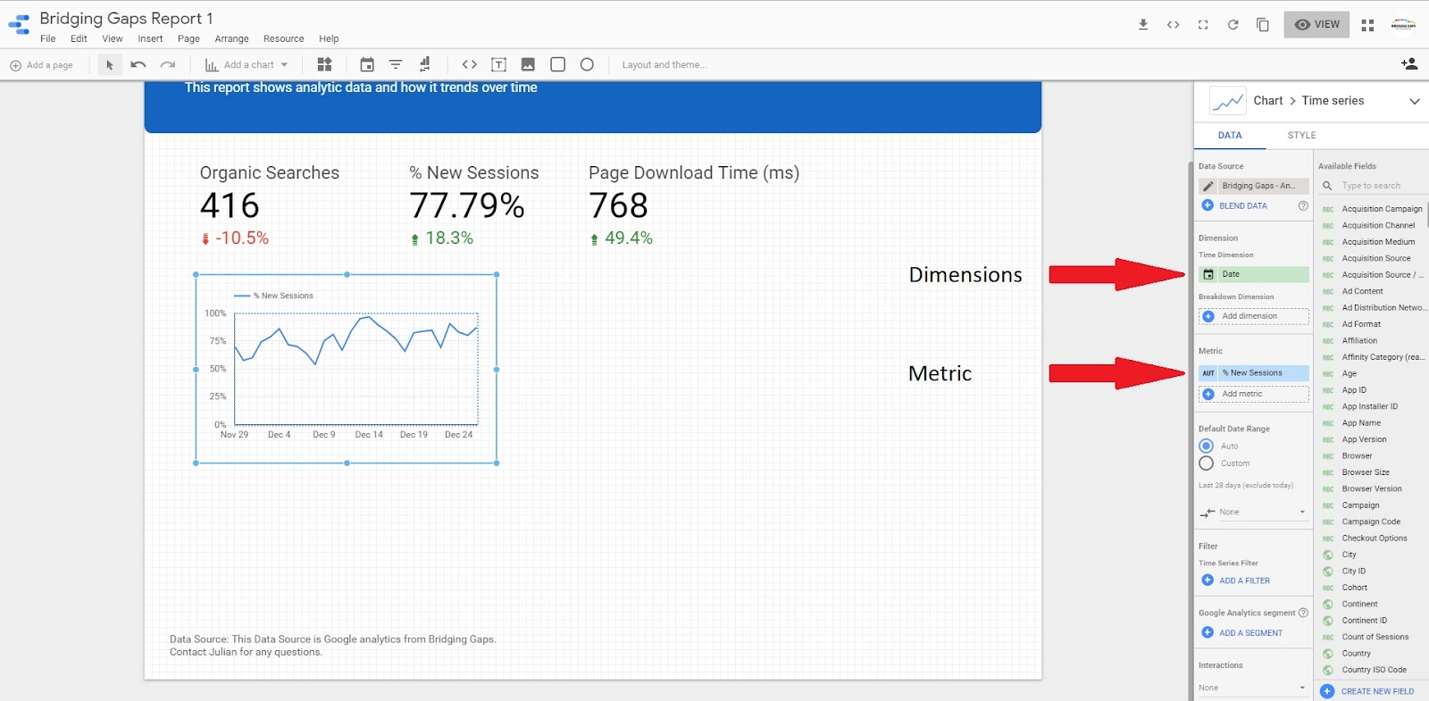
The chart’s default setting highlights sessions per date. Variables can be changed in the ‘DATA’ tab under ‘dimensions and metrics’.
In order to compare results, you can add a line from the previous month data by selecting the previous period in the comparison drop down.
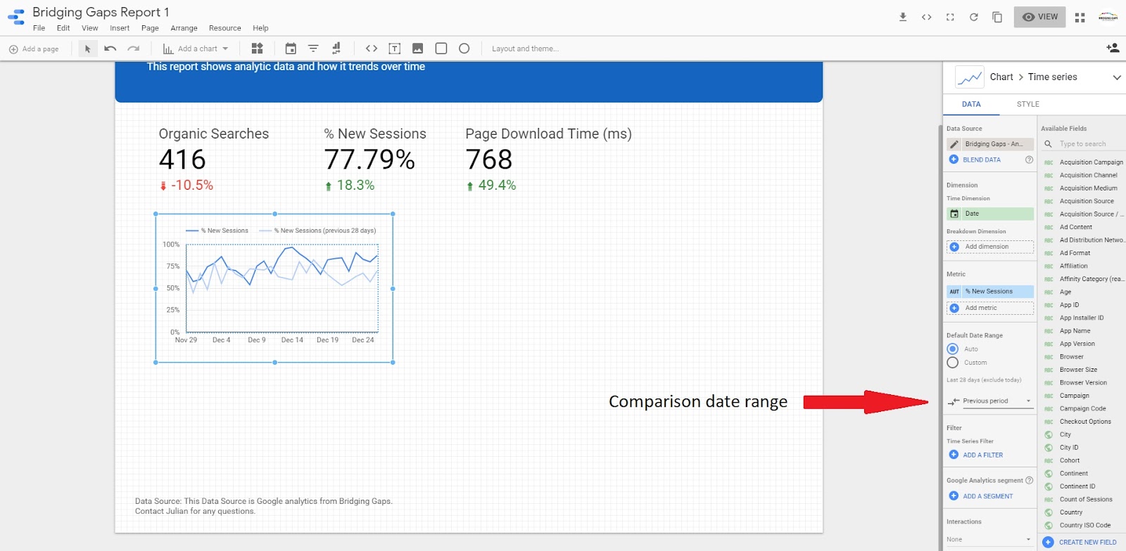
You also have the option to edit data points, colour and titles all found in the ‘STYLE’ tab to the right of the screen.
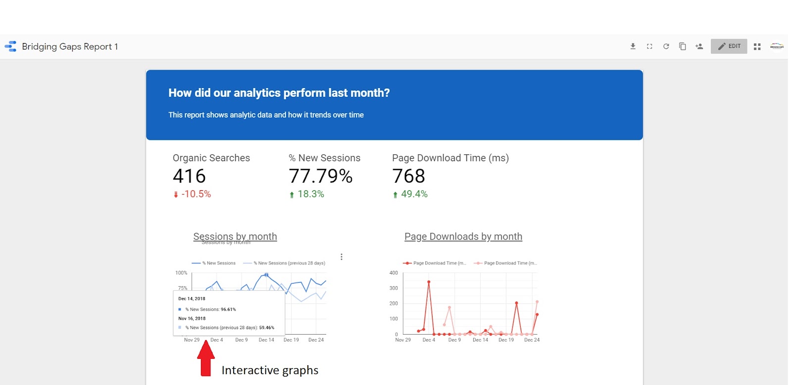
Click ‘view’ in the top right-hand corner to see how users will see this report once you have shared it with them.

You will notice that the charts are interactive so you will be able to see the data points as you move your cursor over the graphs.
We hope this article was helpful and has assisted you in improving your knowledge in Google data studio. Don’t miss the next article in our how to series guide, navigating Google Data Studio’s navigation bars.