Menu


As a digital agency, you’re going to be dealing with a lot of different data sources in your day to day operations. While we all know that information is the very centre of your campaign, accessing, understanding and analysing it is another thing entirely.

Us humans are a visual lot and are always looking to understand things quickly – and when it comes to data, there’s no better way to do this than with Google Data Studio. While there are many options out there for visualising data, Google Data Studio is one of the best options for you, your agency and your clients. But why? In this quick guide, we’re going to take a close look at the advantages of using Google Data Studio and why you and your agency should make the switch.
Google Data Studio It works by syncing up with your existing marketing and analytics data (such as Google Adwords and Analytics), allowing you to centralize your data to deliver insights in a visually attractive, intuitive and easily shareable way.
In their own words, “Google Data Studio turns your data into informative dashboards and reports that are easy to read, easy to share, and fully customizable. Dashboarding allows you to tell great data stories to support better business decisions.”
So, is it a data visualization tool, dashboard or BI tool? Well, the answer is ‘somewhere in the middle’. It strikes a delicate balance of allowing highly customisable data import and visualisation but without going too deeply into data manipulation as offered in fully-fledged BI tools such as powerBI or Pyramid Analytics. Don’t mistake a lack of focus in its hybrid functionality – it’s actually very versatile as you’ll see very soon.
We can go on all day about why Data Studio is brilliant, but for the sake of brevity here are the main reasons:
While Google Analytics limits the number of widgets you can use for reporting, Data Studio lets you have an unlimited number of rows and sources. You can have as many charts and tables as you like, letting you and your clients see the whole picture.
However, the real big feature here is that you can pull data from a huge number of sources all into one place. All you need to do is select which ones you want to use and link your charts to their collection source. Another fantastic feature of this is that when the chart source is updated in any way, your report will be automatically updated in real-time to make sure the data remains accurate.

Google Data Studio lets you source information from:
Then there’s also the option of being able to tap into data warehouses, such as BigQuery which open the doors to much larger-scale data access and interpretation. And then you have your connectors, which is the mechanism by which Data Studio accesses a specific data platform, system, or product. Currently Data Studio offers more than 200 connectors and gives you the option to build your own if you have the technical chops for it.
If you want to connect to platforms such as Facebook, LinkedIn, Twitter, Pinterest, SEMRush and others, this will still be possible through the use of premium partner connectors such as Supermetrics. However, you’ll need to pay for the service so make sure to build this cost into your client quote or marketing budget.
This is one of the largest draws for many users. You can make your dashboard exactly how you want it, starting from a completely blank canvas. Or, you can choose from any number of pre-made templates which do the heavy lifting for you. We’ll get to that a little later.
Starting from scratch lets you drag and drop information as you see fit, adding widgets and goals wherever you want to tell the story you want to tell. After the initial layout is done, you can get stuck into making it look fantastic. This is the fun part, as Google Data Studio offers an enormous level of customisation, right from page sizes and fonts through to colours, images, videos, flows and more. It’s easily the most customisable reporting tool out there at the moment.
This is especially handy when it comes to creating reports for clients. Each one will have their own needs, goals and metrics that they want to display, and with Data Studio you can give them exactly what they want, right down to individual page elements (including their own branding), data sources and layouts.
If you’re not data-savvy, it’s still easy to get an impressive array of charts into your dashboard. You can choose from a huge number of already-built charts to help show your data in the best possible way, in visual forms not available in Google Analytics. Another great thing about this is that you can even customize the period of the data for each chart. You can do this in a custom timeframe (which is great for monthly reporting) or in a rolling capacity, meaning that you can measure data over a larger period of time in relation to the current date.
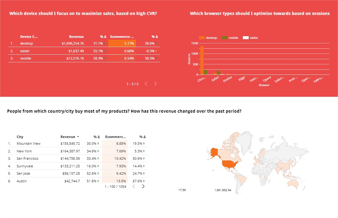
So what does that mean in practical terms? Well, you could show demographics with a pie chart, monthly sales on a line charge, a bar chart for website traffic and even a geographic map to show the sessions by country. All of these types of charts (and many more) are just a few clicks away and also offer the option to add text elements underneath for any commentary or labelling.

Google Data Studio is about as collaborative as it can get. Just like Google Docs, you can share your report with anyone with just a link. Also, you can control who can see, who can comment and who can edit, giving you complete control over the audience and the final outcome. This means that you can still reveal sensitive data without giving away a password or too much access.
Here’s an example scenario: you’ve put together a basic dashboard and want to run it past your clients. You don’t want them the ins and outs of your business but you do need feedback before finalising the report. By giving them limited ‘comment’-type access, they can leave their feedback on everything, leaving you to action their comments or leaving your own as a response. From there, you’ll be able to build a report exactly to their specifications. Then, when all is said and done the report can be downloaded as a PDF, printed out and shared offline at meetings or presentations.
You won’t need to deal with the anxiety of losing your document because of power failure or forgetting to hit ‘save’. Just like with Google Docs and other cloud-based collaborative software, your template will be automatically saved as you go along; and you can revert to earlier versions if need be. This means you can work completely stress-free and without the worry of something happening to your dashboard. Just open it up, do your thing and close the window. Easy.
The deep level of customisation that Google Data studio gives you means that the end product can be tailor-made for the intended audience. For instance, if your audience is technically-minded, you can include a lot more complex data for them to have the full picture. However, if the report is intended for a client who is more interested in only seeing the top-line information, you can include a more visual dashboard which conveys the most important elements at a glance.
Before creating your report, it’s best to ask your audience what kind of data they want to see, and in which format. This will let you get things more correct in the first iteration without having to go back to the drawing board.

Of course, Data Studio also excels for internal use, helping to increase productivity, accuracy, communication and performance. For instance, you can set up pulse reports to let employees and colleagues get an overview of all clients’ data on one dashboard, or create employee progress reports for internal review. You can then compare numbers on a monthly basis to see the data trends on success, failure and other focus areas.
If you’d rather not create a dashboard from scratch, you really don’t have to. There are so many different types of templates out there that you’re bound to find the perfect one.
Whether you want to report on social media traffic, website performance or a range of KPIs, you’ll find the perfect template for you. All you need to do is connect it up to your data sources, make some tweaks as required and you’re good to go. For some inspiration, take a look at some of these Data Studio Templates to get the ball rolling.
Alternatively we specialise in custom data studio template builds, get in touch with us to discuss futher.